
COMPONENTS
Disclosure UI components
Dialogs, drawers, popovers, menus, and expandable content surfaces.
Explore disclosure ui components
See more in workspace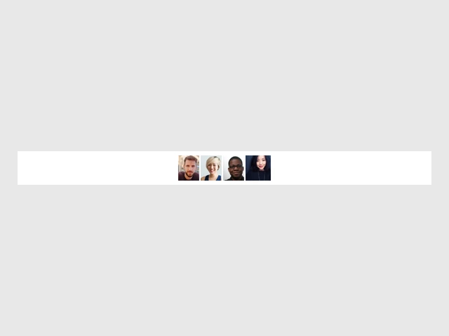
tooltip
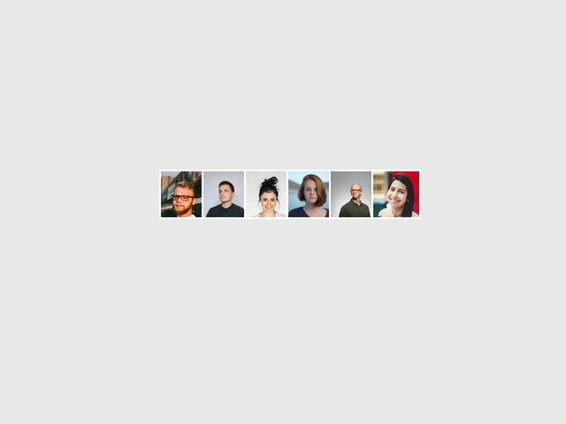
Avatar Group with Tooltip
A visually interactive avatar group with hover effects and tooltips, allowing users to easily view and highlight avatars with smooth animations.
View component
popover
Morphing Popover
A popover that transforms from its trigger into the content using layout animations.
View component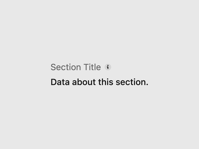
tooltip
Description
Displays a brief heading and subheading to communicate any additional information or context a user needs to continue.
View component
tooltip
Animated Tooltip
A cool tooltip that reveals on hover, follows mouse pointer Features: - Mouse Following: The tooltip moves and rotates with your cursor.
View component
accordion
Dashboard with Collapsible Sidebar
This React code implements a dashboard with a collapsible sidebar featuring various options, a dark mode toggle, and displays various statistics and recent activity.
View component
dropdown
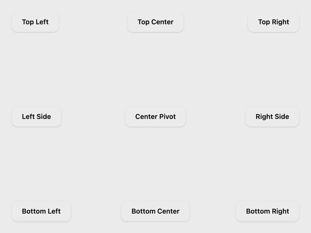
Material UI Dropdown Menu
A highly sophisticated Material Design 3 Dropdown Menu built on top of shadcn/ui and Radix UI.
View component