chip
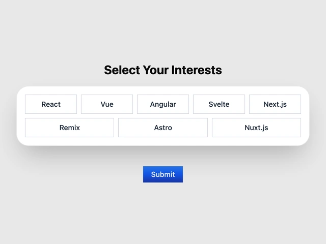
Selector Chips
Selector Chips are used to display a list of items that can be selected.
View component Solice UI
COMPONENTS
Checkboxes, radios, switches, selects, and controls for choosing between options.
Selector Chips are used to display a list of items that can be selected.
View component
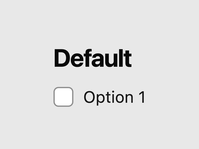
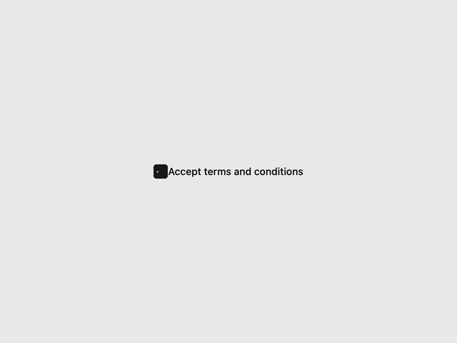
A control that allows the user to toggle between checked and not checked.
View component
The ThemeSwitchButton is an animated icon button designed to toggle the application’s theme between light and dark modes.
View component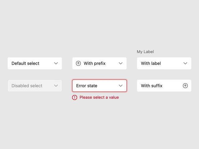

Component that allows users to switch between light and dark themes.
View component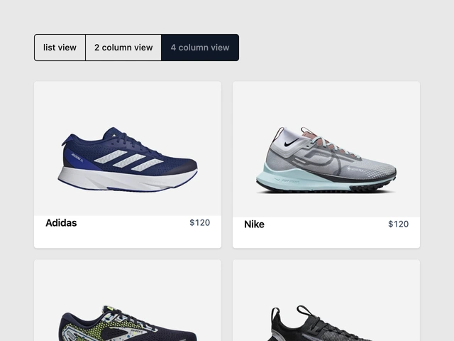
- Container toggling and animating between multiple layouts, useful for your ecommerce store and large lists to enhance user experience.
View component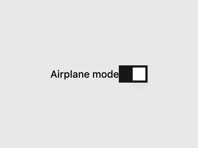
A control that allows the user to toggle between checked and not checked.
View component